

How do I know if my site is Mobile friendly? Does it matter?
What’s all this talk about “mobile first”?
If you have had a website for a few years and tried to improve its rankings, at some point you’ve heard of optimising for mobile or making it mobile friendly. So why are people talking as if this is some new development? Because Google recently made it all that harder to escape it! Before, Google interpreted your site as a visitor using their desktop would. Now, it interprets your site as a visitor using their mobile device would. Why would they do this? Well, it makes sense if you consider that most searches are made from mobile devices these days.
How does mobile first affect me?
If Google’s crawler (the robot that reads and interprets your site) goes through your site and it presents differently to mobile visitors, is missing links, loads slowly and is all around not very easy or pleasant to interact with, it will take notice.
Will it kill your rankings and your hard earned traffic? Probably not, and certainly not right away, but if you don’t have a responsive website, and do not have a dedicated mobile website either, you will eventually pay the price. Don’t let it get to that.
The thing to remember is that Google is trying to see whether a visitor will find information relevant to what they are searching for, see valuable content, and have an experience on your website which isn’t annoying and makes them want to leave. This is why “user experience” on your site is so important, and the main thing to think about with mobile-first.
Best Practises for making your site mobile friendly
- You’ve heard about interstitials? Think about those annoying popup ads you see sometimes. On desktop, we tolerate them because they’re not very hard to close and sometimes we even feel intrigued enough to click on it. But on mobile, it’s a different story. It’s exponentially more annoying and intrusive, and Google recognises that.
- For instance, don’t put a popup that covers your site’s main content, or one that they have to dismiss before accessing that main content.
- Luckily, many of the tools you use to create popups have an option where you can present these ‘interstitials’ only to visitors coming from desktop.
- If you don’t have a responsive site, and don’t have a dedicated mobile site, think about switching to a responsive template.
How do you make the change to mobile friendly depending on your website builder?
Mobile friendly on Squarespace
All Squarespace templates are responsive, so you’re covered. Focus more on avoiding things that interrupt the user like popups.
Mobile friendly on Weebly and Square
All Square’s and Weebly’s new themes are responsive. If you have a very old theme, you should check how it looks on mobile.
Mobile friendly on Wix
Wix has templates which are built to be responsive. However if you’re not using one of these, you still have access to your mobile page editor, even if you’re on the free plan.
Note that the desktop and mobile versions of your site are different viewing modes of the same site; they are not separate. Changes to your desktop site affect your mobile-friendly site. Click the Switch Editor Views icon on the top bar of the Editor, and then click Edit Mobile View.
Mobile friendly on WordPress
By now you know, if you can think of it, there’s a plugin for that. If you’re not already on a responsive theme, you can use WPtouch Mobile plugin to easily show a mobile version of your site with very little hassle.
Mobile friendly on other platforms
SITE123 offers responsive web templates and makes sure your site is search engine friendly with its SEO tools feature, so you don’t need to expend any extra efforts into making sure your site with them is mobile friendly!
How do you check what your website looks like on Mobile?
- For starters, there is our Free Website Report, which will show you how it looks on a mobile phone, tablet, and desktop, as well as tell you how you’re doing on other factors that affect the mobile experience.
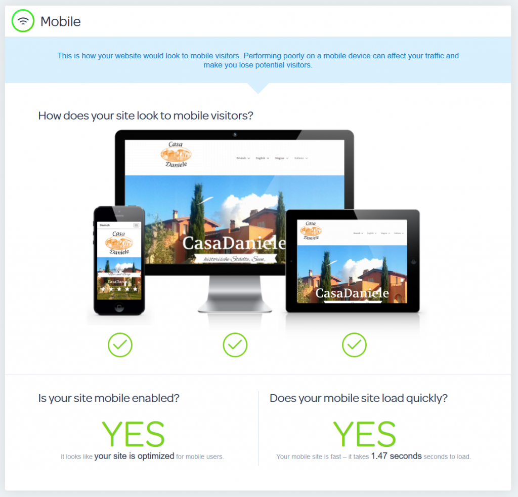
Mobile friendly test on marketgoo’s free website report - You can visit Google’s Mobile Friendly test, which will tell you how user friendly and fast your site is and what changes you can make to help speed it up and otherwise improve upon the visitor experience.
- You can also use a tool like Responsinator to see how your site looks on many different screen sizes, and iPhones as well as Android phones.


