
If you’re a digital designer, by now you may be fed up with talk of ‘design systems’, a topic which during the past years has been en vogue – articles, conferences, talks, books and podcasts have all been throwing around the term. There are endless websites that go over the benefits and examples, offer courses to design them, and manuals about how to implement them.
Therefore, I don’t want this to be just another post on what a design system is and what it’s for, because it won’t provide any real value or offer new information. What I would like to do is share the experience we had at marketgoo in designing our own system, which we’ve named “Ola”.
In our case, the creation of a design system was long overdue, since we were facing issues scaling and diversifying our product while keeping it all consistent. marketgoo isn’t just a web app – it’s evolving into a platform with multiple offerings, for instance a Data API and a WordPress plugin. Additionally, we offer a white label version of our products for resellers, which is why we also need to customize certain styles to fit our Partners’ branding.
Since we were creating a design system, we took the opportunity to rethink certain things, like what do we want to be? how do we want to be seen? what kind of relationship do we want to have with our users? We began by defining design principles that will help us focus on what we are (or what we want to be), and use them to guide us when making decisions. These principles have been shared and assimilated by everyone at marketgoo, not only in the Design department, but company-wide. We want to give design the importance it deserves, and get behind it as a strategic, key component of our product’s future.
Another key step during this process was naming the system. What’s in a name? It might seem inconsequential, but a name takes it from “that thing”, that set of styles and designs, and makes it an entity on its own, giving it importance and incorporating it as a tool into our daily workflow. Developers name it just like they name their other tools such as React, Webpack or Docker.
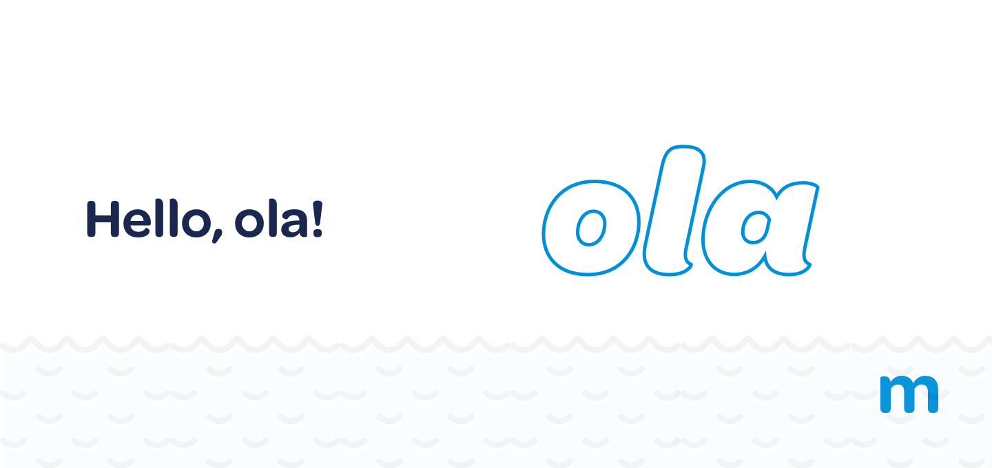
A name assigns status, no matter which one you pick. The important thing is that it has a name, and that everyone uses it. In our case, we wanted it to be related to the sea, which was always present somehow in marketgoo’s visuals (even though we were founded in Madrid). This is how the name “ola” / “wave” in Spanish) came about

Getting buy-in from the entire company was critical. When the potential of the system is clear to everyone, it will be given priority. Implementing a design system is not only the responsibility of the Design team, but something that involves all teams. That our CEO, Dev, Product and Growth teams were able to see its strategic value and give it maximum priority, isn’t something you see in many companies. It’s yet another reason I’m happy to work at marketgoo surrounded by professional, responsible colleagues.
ola is a living, breathing entity. This means it will continuously evolve and improve. As far as scope, we didn’t want to spread ourselves too thin, because of a few reasons.
First of all, we didn’t want to stretch resources as we aren’t a very large team. Second, while we design and implement the system, the machine has to continue working. We can’t bring everything to a halt in order to dedicate a few months to re-doing everything (and this wouldn’t be advisable in any case). This is why it’s a better move to work in phases, making changes and improvements little by little, trying not to break anything along the way.
During this first phase, the changes and improvements we’re working on are focused on two lanes. At the development level, it’s about eliminating spaghetti code on the frontend, and replacing it with reusable, decoupled components, enabling us to move more swiftly in the future.
At the design and interface level, it’s about correcting basic usability and accessibility issues: small, low-contrast text which made legibility difficult, differentiated styles for focused or active status, keyboard navigation improvements, better form usability, consistency, etc.
We’ve also updated our main corporate color, darkening it in order to improve the contrast and meet the WCAG Level AA criteria. This is a clear example of the acquired commitment towards upholding our design principles and meeting their goal of being more accessible and inclusive.
We still have a lot of work to do. As I previously mentioned, we’re still in the first phase and we’ve dedicated even more time to thinking and making decisions (and sometimes rectifying those decisions) than actually doing. We don’t want to reinvent the wheel – the best design is centred around common sense. But we do want our system to evolve at the same rate we do, and that the system adapts to the product and not the other way around.
This entire process has been an extremely enriching experience for everyone. It’s worth noting that although practically everyone is giving feedback and contributing to the project, it’s led by a designer that can code and a programmer with previous experience as a designer (Pedro Parra). These kinds of hybrid design/development backgrounds contribute to constructive teamwork in order to reach a shared objective.
As for tools, we’re using zeroheight for documentation. The idea is to continuously update this documentation, not only with new components and styles, but also adding links to articles and studies that aid us in decision-making we make. Maintaining a design system is complex and a little taxing, which is why we don’t talk about it that much – we’d rather show our work and when possible, rely on external resources for further information.
We do of course use design software like Sketch*, taking advantage of all its features such as synching with zeroheight, libraries and interactive prototypes.
We’ve already developed various components in javascript that are documented using Storybook and our idea is to release them as open source once we’re totally comfortable with the result. But that’s for another post (which my colleague Pedro will write 😉 )
We’ll keep you up to date!
* 2022 update
Over time, the system has grown not only in number of components but also in the different areas covered.
We have included illustrations that can be color-customized for white label and a style guide for copies.
Regarding copies, we have designed a workflow to better synchronise the work of copywriters, designers and developers. This workflow connects a Google Sheet, where copywriters work, with Figma (thanks to a plugin we developed in house) and some scripts to get the latest version of the copies automatically by the engineers, ensuring that any update will be reflected automatically in the Figma prototypes and frontend development.
Finally, when we started with Ola we stated our intentions that it would be an open-source design system, and we can now proudly tell you that it is.
*At the time this post was written, we used Sketch but as of the last edit, we’re using Figma.


Comments are closed.